Is Your Email Newsletter Mobile Optimised?

Many of us have an email provider such as Mailchimp or Aweber attached to our WordPress sites.
Are you sending out an image heavy, highly styled newsletter or are you optimising for mobile devices?
Would it surprise you to hear that a large percentage of your newsletter readers are using mobile devices?
Are you yourself reading lots of email on a small hand held device, and do you find it frustrating?
I think it’s very important to optimise your email newsletters for mobile.
Optimise For Mobile Devices
What do I mean by optimising for mobile? I mean that when someone opens your email newsletter on their phone, they can very easily read and understand your message.
They are not bombarded by huge images.
They don’t have to re-size and swipe left and right to read your message because your template is too wide.
It means removing a barrier to entry so your message (be it information or sales) gets to people on whatever device they choose to use.
Cut The Fluff
Here are the things that will drive your mobile readers mad:
- Sidebars
- Wide formats that requires swipes left and right to read
- Tiny fonts
- Huge images taking up all the screen
Cut out everything that you don’t need in your email, it should be a short message that leads people to a bigger call to action on a blog post, landing page or sales page.
Test It
Once you have optimised your email for mobile, please read it on your mobile device.
Test it, make sure it looks good and is easy to read on a small screen.
Test it on larger tablet screens too, doe it still look good.
Finally test is again on a desktop screen, is it responsive to a bigger screen too, you don’t want to alienate the rest of your readers.
What I Did
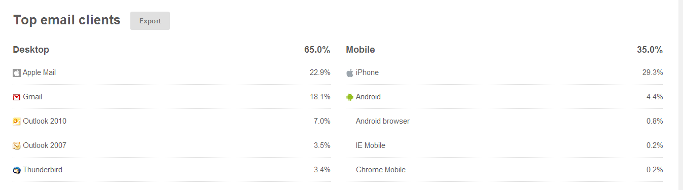
I found out from stats in Mailchimp that over 35% of my readers were on mobile devices, that is a third of people who would struggle to read my newsletter.
Here’s a screen shot to show the break down.
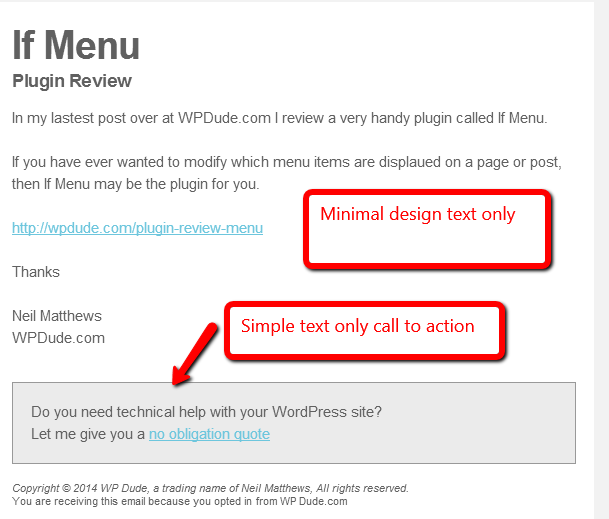
So I redesigned the template on my newsletter, I cut out the sidebar and the images, leaving only a minimal template that shows off a header, a brief description of my post or offer and link to my main site.
I also have a call to action to sell my services
This is plain black and white and shades of grey text, nothing fancy but it is very easily read on all types of device. Here’s a screen dump of my new template.
Remember A Responsive Website
What’s the point in making your email template readable, but when your reader clicks through to your main site you have an unresponsive main website that they cannot easily read on their phone.
Select a theme that is responsive or go for one of the many mobile ready plugins such as wp-touch that do the job for you https://wordpress.org/plugins/wptouch/
What You Should Do
My advice to you is look at the various templates your email provider has and select a responsive one, Mailchimp and Aweber both have these and I’m pretty sure the other main email providers will too.
If they don’t there is always the option to have a text only email.
Wrap Up
We are moving away from our desktops at a rapid pace, responsive websites and native iPhone/iPad and Android apps are taking over from our websites. We need to embrace the mobile device or our desktop optimised websites will not serve us.
Photo Credit: zappowbang via Compfight cc